Lâu lắm chả biên Phóng sự - Cái thể loại nửa Văn, nửa pha Báo chí mà cái mình ưa thích biên mấy chục năm trước nhẽ đang trở lại.
|
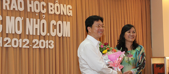
 Ước Mơ Nhỏ trở lại – Tức là tôi – người biên bài cũng trở lại. Nhẽ chả có gì đáng nói cái vụ trở lại với đa số người. Nhưng với tôi thì trở lại biên Ước Mơ Nhỏ là cả một sự phấn đấu....
  Kể từ ngày về Huế đến giờ cũng được gần 4 năm. Đó cũng là thời gian Mình gắn bó với Quỹ học bỗng Ước Mơ Nhỏ, đã cùng Quỹ đi khắp nơi để trao cho các em những suất học bỗng hằng năm hay trao tủ sách yêu thương cho các trường nghèo! Tôi cũng đã quá qu...
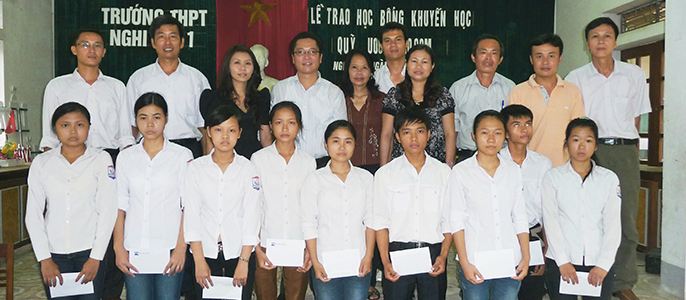
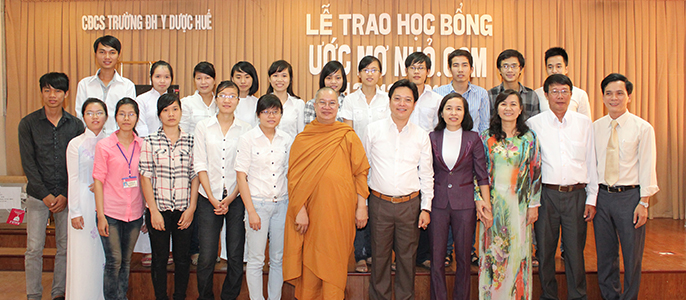
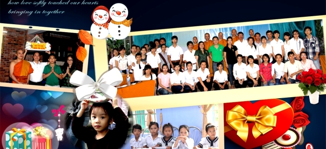
  Đoàn chúng tôi dành cả một buổi để về Phú Mậu. Bữa nay là rằm trung thu. Trường Tiểu học Phú Mậu tổ chức liên hoan và thi bày cỗ trung thu kết hợp Ước Mơ Nhỏ trao học bổng cho các cháu luôn....
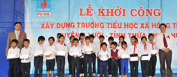
  Tháng 4 năm 1954, đại diện 9 bên Nam-Bắc VN, Lào, Cambodia, Trung Hoa, Pháp, Anh, Mỹ, và Liên Xô gặp nhau tại Genève, Thụy Sỹ để thương thảo 1 giải pháp hoà bình cho VN.
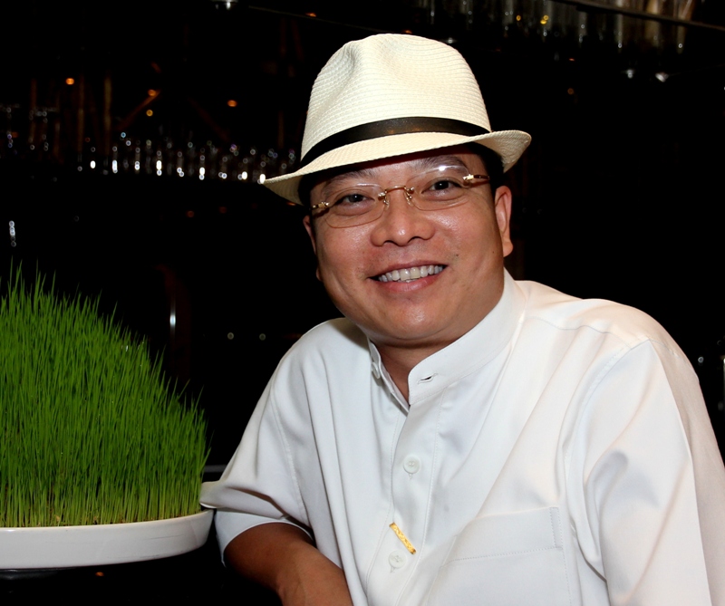
")
")
")


